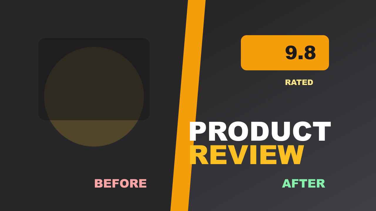
Thumbnails drive roughly 90% of a video's click-through performance. Your title and SEO matter, but if the thumbnail doesn't stop the scroll, none of that work converts into views. The good news: making a great thumbnail doesn't require design experience. It requires knowing the rules.
This guide walks through every step — from dimensions to design to testing — so you can create thumbnails that actually get clicked.
Step 1 — Start With the Right Dimensions
Every YouTube thumbnail should be 1280 × 720 pixels at a 16:9 aspect ratio. This is YouTube's official recommendation. Anything smaller gets upscaled by YouTube, which introduces blurriness. Anything with the wrong aspect ratio gets letterboxed or cropped.
Keep the file under 2 MB and use JPG, PNG, or WebP format. JPG at 85–90% quality is usually the sweet spot — sharp enough to look professional, small enough to stay under the limit.
If you already have an image at the wrong size, resize it to 1280×720 in seconds before uploading. No need to redo your design.
Step 2 — Choose a Background
The background sets the mood and determines how much your subject pops. There are three approaches that work consistently:
Gradient backgrounds are the most popular choice among high-performing channels. A two-color gradient creates visual depth without competing with your subject. Warm gradients (orange-to-red, yellow-to-orange) tend to perform well in entertainment and gaming niches. Cool gradients (blue-to-purple) work well for tech and business content.
Blurred photo backgrounds give a professional, polished look. Take a screenshot or photo related to your video, apply a blur, and place your subject on top. The blur creates separation without losing context.
Solid colors are the simplest option and still effective when the color is bold and high-contrast. Avoid muted or pastel tones — they disappear in a crowded feed.
The screenshot beautifier tool lets you apply gradient and blurred backgrounds to any image instantly, without opening Photoshop.
Step 3 — Add Bold Text
Not every thumbnail needs text, but when you use it, make it count. The rules:
- 3–5 words maximum. Thumbnails are viewed at small sizes. More than five words becomes unreadable.
- High contrast. White text on dark backgrounds, or dark text on light backgrounds. Avoid yellow-on-white or red-on-orange.
- Large font size. If you can't read the text when the thumbnail is shrunk to 320 × 180 pixels, it's too small.
- One font, two weights. Use a bold weight for the key word and a regular weight for supporting text. Mixing three or more fonts looks amateur.
Avoid restating the video title in the thumbnail. Use the thumbnail to add context or emotion that the title doesn't convey — the two should work together, not repeat each other.
Step 4 — Include a Face or Focal Point
Thumbnails with human faces consistently outperform those without. The psychology is straightforward: people are wired to look at faces, especially expressive ones. A face showing surprise, excitement, or curiosity draws the eye and creates an emotional hook.
If you're not on camera, use a strong focal point instead — a product, a before/after split, a dramatic visual that represents the video's payoff.
A few practical tips:
- Expression matters more than appearance. An exaggerated reaction outperforms a neutral headshot every time.
- Eye contact with the camera creates a direct connection with the viewer.
- Position the face on one side and text on the other. Don't let them overlap.
- Cut out the background behind the face to place it on your chosen background cleanly.
Step 5 — Test Before Publishing
Designing a thumbnail at full size on a large monitor is misleading. YouTube displays thumbnails at multiple sizes depending on where they appear:
| Placement | Approximate Display Size |
|---|---|
| Desktop home feed | 320 × 180 px |
| Search results | 246 × 138 px |
| Mobile full-width | 480 × 270 px |
| Sidebar / Up Next | 168 × 94 px |
A thumbnail that looks great at 1280 × 720 can become unreadable at 168 × 94. Before uploading, preview your thumbnail across all YouTube placements — desktop, mobile, search, and sidebar — to catch problems before they cost you clicks.
Common Thumbnail Mistakes to Avoid
Clickbait that doesn't deliver. Misleading thumbnails spike your click-through rate briefly, then tank your watch time. YouTube's algorithm penalizes videos with high CTR but low retention. Keep thumbnails honest.
Too much going on. Busy thumbnails with multiple faces, lots of text, and complex backgrounds are hard to parse at small sizes. Simplify.
Inconsistent branding. Viewers recognize channels by their thumbnail style. Pick a consistent color palette, font, and layout and stick to it. This builds recognition over time.
Ignoring mobile. More than 70% of YouTube watch time happens on mobile. Design for small screens first.
Not checking CTR. After publishing, monitor your click-through rate in YouTube Studio. A CTR below 2% usually means the thumbnail needs work. Use the CTR score analyzer to get feedback before you publish.
Free Tools to Make YouTube Thumbnails
You don't need paid software to make professional thumbnails. Here's a complete free toolkit:
| Tool | What It Does |
|---|---|
| Workbench | Full canvas editor with templates, text, and image layers |
| Screenshot Beautifier | Adds gradient or blurred backgrounds to screenshots |
| Thumbnail Tester | Previews your thumbnail across all YouTube placements |
| CTR Score Analyzer | Scores your thumbnail's click potential before publishing |
| Image Resizer | Resizes any image to 1280×720 in seconds |
Start making your thumbnail free →
Frequently Asked Questions
What size should a YouTube thumbnail be? YouTube thumbnails should be 1280 × 720 pixels at a 16:9 aspect ratio. The maximum file size is 2 MB. Accepted formats are JPG, PNG, GIF, and WebP. JPG is recommended for most use cases because it produces smaller files at high quality.
How do I make a YouTube thumbnail for free? Use a free canvas editor like the Workbench to design your thumbnail from scratch, or use the screenshot beautifier to quickly add a professional background to an existing image. Both tools work in your browser with no sign-up required.
What makes a YouTube thumbnail get more clicks? High-contrast colors, a clear focal point (usually a face with an expressive emotion), short bold text (3–5 words), and a design that's readable at small sizes. Testing your thumbnail before publishing using a preview tool also helps catch issues early.
How many words should a YouTube thumbnail have? Three to five words is the sweet spot. Thumbnails are displayed at small sizes — especially on mobile — so text needs to be large and minimal to remain readable. If you need more context, let the video title carry it.
Should I put text on every YouTube thumbnail? Not necessarily. Many top-performing thumbnails use no text at all, relying entirely on a strong visual. Text works best when it adds information the image alone can't convey — like a number ("5 Mistakes"), a contrast word ("Before / After"), or an emotional hook ("This Changed Everything").